
Best Fall Fonts for Matching Rustic Clipart (Using Free Fonts Available in Canva)
When it comes to designing autumn-inspired products — from cozy planner pages to rustic fall printables and clipart bundles — choosing the right font can make all the difference. The right typography brings warmth, texture, and that charming handmade feel that perfectly complements your seasonal graphics. 🍂
If you’re using Canva, you already have access to a wide range of free fonts that are perfect for rustic fall designs. Whether you’re creating Etsy listings, Pinterest graphics, or printable wall art, these fonts will add the finishing touch to your autumn creations — no paid subscriptions required!

1. Playlist Script
Style: Handwritten, casual, warm
Perfect for: Fall quotes, cosy product titles, and seasonal stickers
Why it works:
Playlist Script captures the essence of autumn through its effortless, handwritten charm. It’s one of those fonts that instantly evokes warmth — like the feeling of wrapping your hands around a mug of hot chocolate on a crisp fall morning.
Its slightly irregular strokes mimic real penmanship, giving your designs that perfectly imperfect look that feels personal and handcrafted. This is exactly why it complements rustic clipart so beautifully — think watercolour pumpkins, dried leaves, wooden textures, and cosy fall scenes. The font’s flowing curves and natural rhythm enhance the organic, earthy feel of your artwork without overpowering it.
When used for product titles or quotes, Playlist Script draws attention while keeping the tone soft and inviting. It’s ideal for printable wall art, planner covers, or social media graphics where you want to capture that “cosy autumn” vibe.
Design Tip:
Use Playlist Script for your main heading or featured words (like “Cosy,” “Grateful,” or “Pumpkin Season”) and pair it with a clean, modern font like Montserrat for subheadings or body text. This balance of handwritten and structured fonts creates harmony — rustic charm meets modern professionalism.
Best combo: Playlist Script (for headlines) + Montserrat (for clean subheadings)
→ Ideal for product packaging, Pinterest pins, Etsy thumbnails, or branding mock-ups that need to feel both creative and polished.
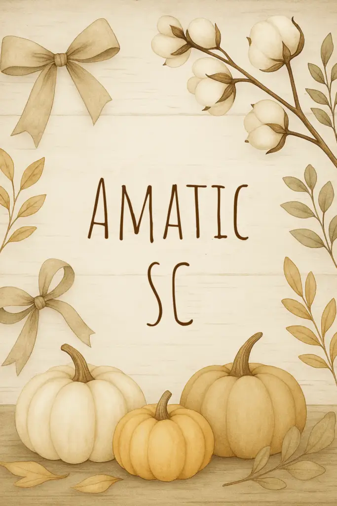
2. Amatic SC
Style: Tall handwritten print
Perfect for: Labels, farmhouse signs, and minimalist rustic templates
Why it works:
Amatic SC has a distinct charm that feels handcrafted and full of personality. Its tall, narrow letters give it an organic, slightly imperfect aesthetic — the kind of handwritten look you’d find on chalkboard café menus, rustic wedding signs, or vintage market labels.
What makes this font so versatile is its simplicity. It’s not overly decorative, which means it works beautifully when you want your clipart or textures to shine without overwhelming the design. Whether you’re working on planner headers, farmhouse wall art, printable tags, or digital product covers, Amatic SC adds a friendly and approachable touch.
Because of its condensed shape, it’s also incredibly space-efficient — you can include longer titles or headings without losing readability. This makes it a great choice for Etsy thumbnails, product mockups, and Pinterest pins where space is limited but visual appeal is essential.
Design Tip:
Try using Amatic SC in uppercase for bold, rustic titles, or mixed case for a more playful, relaxed tone. It pairs wonderfully with soft watercolor clipart — like pumpkins, foliage, or linen textures — giving your design a natural, down-to-earth feel.
Pair with:
✨ Amatic SC (for titles or headers) + Lato or Open Sans (for body text or product descriptions)
→ This pairing strikes the perfect balance: Amatic brings the handcrafted, rustic feel, while Lato or Open Sans keeps the design modern, clean, and easy to read.

3. Tan Nimbus
Style: Bold vintage serif
Perfect for: Product branding, logos, and bold autumn headlines
Why it works:
Tan Nimbus strikes that perfect balance between classic elegance and rustic warmth. With its bold, slightly weathered serif style, it carries the kind of vintage charm that instantly gives your designs a sense of heritage and craftsmanship. It feels timeless yet contemporary — the kind of font you’d imagine stamped on artisanal packaging, engraved on handmade labels, or featured in an upscale fall campaign.
This font is particularly effective for titles, headers, and branding marks that need to stand out while still feeling approachable and grounded. The subtle imperfections in its letterforms make it feel authentic, not overly polished — perfect for designs inspired by nature, tradition, or cozy handmade goods.
If you’re working on rustic clipart collections, digital papers, or autumn-themed printables, Tan Nimbus adds that editorial, high-end touch that makes your products feel professionally designed. It’s also fantastic for Pinterest graphics or Etsy product banners, giving your visuals a sense of sophistication that pairs beautifully with watercolor or textured backgrounds.
Design Tip:
Try using Tan Nimbus for your main titles and pairing it with a handwritten or brush font for subtext — this creates a visually rich mix of strength and softness. Use it in warm, deep hues like chestnut, cinnamon, or golden brown to enhance its nostalgic, autumn-inspired feel.
Pair with:
✨ Tan Nimbus (for bold headings) + Brusher or Great Vibes (for cursive accent text)
→ This combination gives you a perfect contrast: strong and grounded meets elegant and fluid — ideal for blending rustic authenticity with modern charm.
4. Brittany
Style: Script with elegant, looping strokes
Perfect for: Invitations, planner covers, and branding graphics
Why it works:
Brittany is one of those fonts that instantly transforms a simple design into something warm, inviting, and beautifully refined. With its smooth, flowing lines and delicate loops, it captures that perfect balance between romantic elegance and cozy charm. It’s the kind of font that feels handwritten with care — like the finishing touch on a love note, a candle label, or a seasonal printable.
Brittany shines in fall-inspired projects because it embodies that “pumpkin spice and everything nice” aesthetic — comforting yet polished. It adds a touch of grace to your rustic clipart collections, especially when paired with watercolor illustrations such as autumn florals, coffee mugs, candles, and cozy sweaters. The font’s natural movement makes it feel effortless, while its legibility ensures your designs remain professional and easy to read.
For digital product sellers, Brittany is a go-to choice for creating planner covers, product packaging, or brand logos that need to feel stylish yet approachable. It also works beautifully in Pinterest graphics or social media posts where you want to express warmth and creativity without losing sophistication.
Design Tip:
Use Brittany for headlines or key accent phrases in your designs — for example, “Autumn Collection,” “Cozy Vibes,” or “Grateful Heart.” Keep supporting text simple and elegant with a serif font to avoid overwhelming the design. Try layering it over soft watercolor backgrounds or beige linen textures for that refined rustic feel.
Pair with:
✨ Brittany (for main titles or script accents) + Playfair Display (for elegant subheadings or body text)
→ This combination is timeless: Brittany adds charm and personality, while Playfair Display anchors the design with structure and sophistication. Together, they create a romantic yet modern look that’s perfect for cozy fall branding and printables.


5. Lovelo
Style: Geometric sans serif
Perfect for: Modern rustic branding, bold product titles, and pins
Why it works:
Lovelo is the perfect choice when you want to blend modern minimalism with rustic authenticity. Its clean, geometric structure provides a crisp contrast to the soft, organic textures of watercolor clipart and hand-drawn illustrations. While many rustic fonts lean vintage or handwritten, Lovelo brings a fresh, contemporary twist — making your designs feel polished, professional, and ready for today’s digital marketplaces.
This font works especially well in digital product branding where clarity and legibility are key — such as Etsy thumbnails, Pinterest pins, social media banners, and shop logos. Its bold, confident lines draw attention instantly, helping your titles and brand names stand out even when displayed in smaller formats.
What makes Lovelo truly versatile is how easily it complements textured and handcrafted design elements. When paired with rustic clipart, like watercolor leaves, pumpkins, or cozy fall icons, it creates a sophisticated balance — rustic charm meets modern simplicity. It’s ideal for creators who want to maintain warmth and creativity while presenting a sleek, upscale look.
Design Tip:
Use Lovelo in uppercase for strong visual impact — perfect for titles or product names. For a cohesive aesthetic, pair it with neutral backgrounds or lightly textured surfaces (linen, paper grain, or wood). Accent it with warm tones — gold, cream, or terracotta — to keep the design grounded in that rustic, autumn palette.
Pair with:
✨ Lovelo (for bold titles or headings) + Cinzel Decorative (for elegant subheadings or accent words)
→ This pairing balances clean, modern structure with timeless classical beauty. Together, they deliver a refined rustic style ideal for both branding and high-end printable collections.
6. Glacial Indifference
Style: Minimal sans serif
Perfect for: Pinterest graphics, email headers, and product listings
Why it works:
Glacial Indifference is the epitome of modern simplicity. Its clean lines, balanced spacing, and subtle geometric form make it the ideal font when you want your visuals — especially your clipart, textures, or photography — to take center stage. While many rustic designs lean into ornate or handwritten fonts, Glacial Indifference brings in a breath of fresh air with its minimalist, professional edge.
This font shines in digital product branding because it’s both timeless and versatile. Whether you’re designing Pinterest pins, Etsy product listings, email graphics, or product mock-ups, it maintains consistency and clarity across every touchpoint. The beauty of Glacial Indifference lies in its neutrality — it doesn’t compete for attention but instead creates a harmonious balance that lets your design elements and color palette breathe.
For digital product entrepreneurs, this font is a must-have for creating brand cohesion. Use it for your logo subtext, website headers, or shop categories to unify your visuals and build instant recognizability. It’s especially powerful when paired with rustic clipart or watercolor textures, offering that crisp contrast between handcrafted and modern.
Design Tip:
Use Glacial Indifference in uppercase for a bold, editorial feel, or sentence case for a softer, minimal look. It pairs beautifully with warm neutrals, textured backgrounds, and gold or copper accents — creating a rustic-modern fusion that feels both cozy and clean.
Pair with:
✨ Glacial Indifference (for headings or clean body text) + Tangerine (for script accents or signatures)
→ This pairing blends modern structure with organic charm — perfect for rustic branding, minimalist templates, or high-end digital product presentations.


7. Brusher
Style: Bold brush script
Perfect for: Social media graphics, product launches, and quote art
Why it works:
Brusher is all about energy, texture, and attitude. With its bold, free-flowing brushstrokes, it brings a burst of personality to your designs — making it perfect for autumn-inspired graphics, cozy quotes, and eye-catching product titles. It has that “painted by hand” authenticity that instantly adds movement and life to your layouts, while still maintaining enough structure to stay readable across different digital platforms.
Unlike delicate or minimalist scripts, Brusher thrives on contrast. It’s unapologetically bold — ideal for statement words such as “Cozy,” “Grateful,” “Harvest,” or “Sweater Weather.” When paired with watercolor clipart or rustic design elements, it feels expressive and handmade, adding warmth and excitement to your visual storytelling.
This font is especially powerful for social media graphics and product launches, where you need to grab attention quickly. It’s perfect for Pinterest pins, Etsy banners, Instagram posts, and seasonal marketing materials, giving your content a creative, hand-crafted edge that feels authentic and full of personality.
Design Tip:
Use Brusher as your primary font for headlines or short statements, and let it shine against simple, neutral backgrounds or textured surfaces. Try using it in warm, rich tones like deep orange, burnt sienna, or espresso brown to tie it into fall color palettes. Balance its textured look by pairing it with a refined serif or sans serif for subtext.
Pair with:
✨ Brusher (for bold titles or expressive phrases) + Libre Baskerville (for elegant, readable body text)
→ This pairing gives your designs both drama and balance — Brusher draws the eye, while Libre Baskerville keeps things grounded, clean, and easy to read. Together, they’re a perfect rustic combination for modern creatives.
8. Cinzel Decorative
Style: Elegant serif
Perfect for: Seasonal branding, product packaging, and quote designs
Why it works:
Cinzel Decorative brings an air of timeless sophistication to any rustic design. Inspired by classical Roman inscriptions, this elegant serif font combines tradition and artistry, making it ideal for creators who want their autumn collections to feel luxurious, refined, and high-end. Its sculpted letterforms add depth and gravitas — like something carved into stone — while the delicate curves of its decorative edges give it a soft, artistic finish.
This balance of strength and detail makes Cinzel Decorative perfect for branding, packaging, and hero typography. It elevates seasonal collections, transforming simple text into something that feels intentional and premium. Whether you’re designing product labels, greeting cards, or social media graphics, Cinzel instantly communicates quality and craftsmanship.
When paired with rustic clipart, such as watercolor pumpkins, golden leaves, or cozy autumn florals, Cinzel Decorative creates a stunning contrast — the polished meets the organic. It’s particularly effective for elegant fall branding where you want to capture both warmth and sophistication.
Design Tip:
Use Cinzel Decorative for titles, product names, or standout quotes, and let it lead the visual hierarchy. To soften its formal elegance, pair it with handwritten or script fonts for subheadings or accents — this creates that perfect rustic-luxe aesthetic your audience will love. Keep the color palette warm and refined: think champagne gold, cocoa brown, soft cream, and muted copper tones.
Pair with:
✨ Cinzel Decorative (for headlines or branding titles) + Playlist Script (for elegant accent text)
→ This pairing embodies timeless charm: Cinzel brings structure and prestige, while Playlist Script adds warmth and a human touch — a perfect union of classical and rustic design.

Pro Tip:
When pairing fonts in Canva, try mixing a script or serif font (for warmth and personality) with a clean sans serif font (for balance and readability). For example:
Playlist Script (heading) + Montserrat (body)
Brittany (heading) + Playfair Display (subheading)
This combo approach keeps your design cohesive and professional — ideal for mock-ups, Pinterest pins, or printable templates.
Design That Feels Like Fall
When your fonts and clipart work in harmony, your designs feel intentional and full of character — the kind of creations that instantly draw people in. Great fall design isn’t just about color; it’s about emotion. It’s about capturing the warmth of a cozy morning coffee, the texture of weathered wood, and the charm of handwritten notes on kraft paper.
Experiment with these free Canva fonts to craft autumn products that feel both nostalgic and beautifully modern. Whether you’re designing planners, printables, or branding kits, the right typeface has the power to elevate your rustic clipart from simple to stunning — creating designs that inspire comfort, creativity, and connection all season long.
Access Free Commercial-Use Products or Unlock Full PLR Rights
Experiment with these free Canva fonts to craft autumn products that feel both nostalgic and beautifully modern. If you’d love ready-made design assets to pair with your fonts, join our Free Click Hub Marketing Membership — where we upload new clipart, templates, and digital resources you can use in your products every week.
✨ Join for free to access commercial-use products, or upgrade to our £9.99/month PLR Membership for full access to all products with private label rights. New resources are added regularly, so your creative library keeps growing!

 Visit
Visit