15 Christmas Colour Palettes to Elevate Your Digital Products This Festive Season
When it comes to creating eye-catching Christmas products, colour is everything. The right palette can transform a simple design into something that feels warm, festive, and irresistibly clickable. Whether you’re designing clipart, planners, greeting cards, digital papers, or mockups — these 15 Christmas colour schemes will inspire your creativity and help your products shine in your shop and on Pinterest.
Each palette has been thoughtfully crafted to evoke a specific festive mood — from cosy blush tones to timeless tartans and modern metallics. Let’s explore how you can use each in your digital creations.

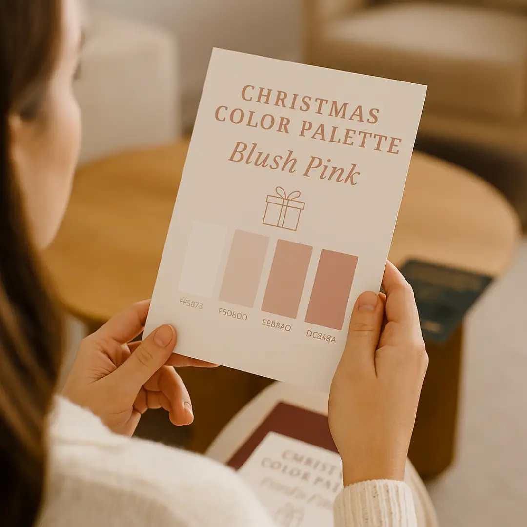
1. Blush Pink
Hex Codes: FFF5F3 | F5D8D0 | EEB3AD | DC848A
If Christmas had a soft whisper, it would sound like Blush Pink. This palette captures the beauty of understated elegance — calm, warm, and feminine without being overly sweet. It evokes the charm of rose-tinted ornaments, cosy candlelight, and ribboned gift boxes wrapped with care.
For digital product creators, Blush Pink is the perfect choice when designing for audiences who love luxury with a minimalist touch. Its soft hues work beautifully across printable planners, branding kits, festive gift tags, or digital stationery collections. Whether you’re creating social media templates or digital wallpapers, this palette adds a subtle sophistication that feels effortlessly high-end.
Blush Pink pairs especially well with metallic gold or champagne accents, enhancing the sense of festive warmth without overpowering the design. You can also blend it with creamy neutrals or muted beige backgrounds to maintain that clean, modern aesthetic digital buyers love.
It’s particularly effective for wellness, lifestyle, or boutique brands — think yoga studios, candle makers, or self-care creators selling printable journals or affirmations. These tones convey softness, comfort, and emotional calm — perfect for connecting with audiences who crave relaxation during the hectic Christmas season.
If you’re styling product mockups, try linen textures, neutral wood flatlays, or soft white backgrounds to make the blush tones stand out. Add a sprinkle of gold typography or delicate script fonts for a touch of holiday charm.
In essence, Blush Pink is the colour story of grace and warmth — a palette that turns simplicity into luxury and transforms any Christmas product into something irresistibly beautiful.
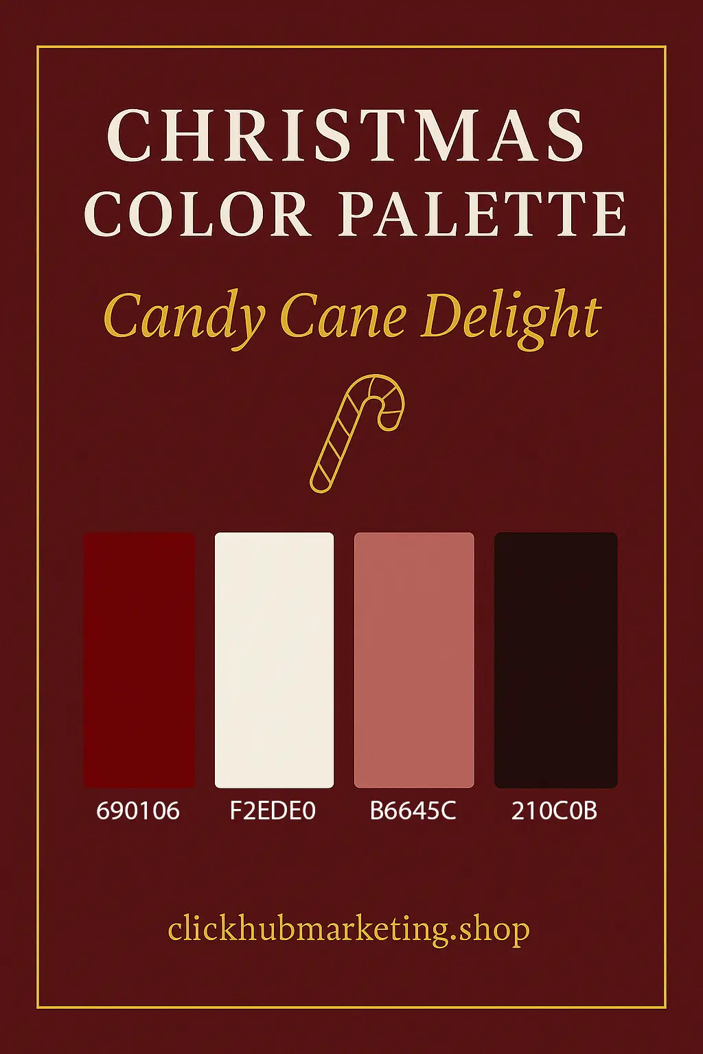
2. Candy Cane Delight
Hex Codes: 690106 | F2EDE0 | B6645C | 210C0B
Few colour combinations capture the spirit of Christmas quite like red and white — timeless, joyful, and instantly recognisable. Candy Cane Delight celebrates the season’s most nostalgic pairing, balancing deep berry reds with creamy vanilla tones to create a palette that feels both comforting and full of festive energy.
This colour scheme is ideal for digital product sellers who want to infuse their designs with classic Christmas warmth. The richness of the red (690106) evokes ribbons, Santa’s suit, and spiced mulled wine, while the soft cream tones (F2EDE0) bring balance and a touch of vintage charm.
Use Candy Cane Delight in retro-inspired clipart, Christmas card templates, printable wrapping papers, or seasonal pattern collections. It works beautifully for Etsy or Creative Market listings that lean into traditional holiday imagery — think gingerbread houses, candy stripes, or rustic kitchen scenes.
If you’re creating digital papers or seamless patterns, consider pairing this palette with subtle gold or green accents for added depth. The red tones photograph exceptionally well against warm neutral backdrops, making your product mockups pop on Pinterest and Instagram feeds.
Typography also plays a key role here — handwritten or brush-style fonts pair perfectly with this palette, giving your designs that handcrafted Christmas aesthetic buyers love. It adds authenticity and evokes that homemade, fireside feeling that makes customers nostalgic for simpler times.
For product photography or mockups, use textured backgrounds like kraft paper, aged wood, or vintage linen. These materials highlight the warmth of the palette and give your listings a cosy, inviting look.
In essence, Candy Cane Delight isn’t just a colour scheme — it’s the heart of Christmas tradition. It’s perfect for creators who want to bring nostalgia, warmth, and timeless festive joy to their digital products this season.

3. Christmas Cheer
Hex Codes: F0E2C3 | A8832E | 600E0E | 09160D
If you could bottle the feeling of Christmas Eve — the glow of twinkling lights, the scent of mulled wine, and the warmth of laughter echoing through a bustling festive market — it would look exactly like Christmas Cheer.
This palette blends opulent golds, deep reds, and evergreen tones to create a look that’s classic, inviting, and full of seasonal spirit. It captures everything people love about the holidays — nostalgia, warmth, and a hint of grandeur — making it a go-to choice for digital creators looking to infuse sophistication into their festive collections.
For digital product sellers, Christmas Cheer is perfect for:
Holiday social media templates that sparkle with warmth and festive charm.
Planner pages, printable inserts, and advent calendars designed to motivate and delight throughout December.
Seasonal marketing campaigns or email headers that need a strong visual presence while maintaining elegance.
The golden hue (A8832E) adds a rich metallic accent that pairs beautifully with both dark and light backgrounds, while the deep red (600E0E) introduces passion and traditional warmth. The forest green (09160D) grounds the palette, balancing its vibrancy and ensuring it photographs beautifully across flatlays, mockups, and lifestyle images.
In mockup design, pair these colours with natural textures — think dark wood grain, candlelight, or velvet backgrounds — to enhance the feeling of depth and luxury. For typography, serif fonts or elegant calligraphy styles complement this palette perfectly, creating a polished and timeless look ideal for professional digital shops.
When used in digital papers, clipart, or product packaging templates, Christmas Cheer creates a sense of richness that buyers instantly connect with. It evokes the feeling of gift-giving, celebration, and togetherness — emotions that translate beautifully into sales during the festive season.
In short, Christmas Cheer is more than a colour palette; it’s an atmosphere — the golden warmth that makes your Christmas products feel alive. It’s perfect for creators who want their designs to radiate comfort, nostalgia, and a little touch of magic.
4. Christmas Rose
Hex Codes: 6B241F | CA9778 | 1E321C | 11170D
Softly romantic yet grounded in nature, Christmas Rose embodies the heart of a rustic Christmas. Imagine candlelight flickering against aged wood, dried rose garlands hanging from the mantle, and the subtle scent of pine and cinnamon filling the air. This palette brings all of that warmth into your designs — a perfect fusion of rustic charm and timeless elegance.
The deep rose hue (6B241F) adds a touch of vintage romance, while the muted blush (CA9778) softens the tone, giving your designs a delicate balance between strength and grace. The complementary forest greens (1E321C and 11170D) root the palette in nature, creating a sophisticated colour harmony that feels both earthy and luxurious.
For digital product creators, Christmas Rose is ideal for projects that celebrate craftsmanship, creativity, and connection. Use it to design:
Rustic wedding or festive stationery, where natural beauty meets seasonal celebration.
Digital scrapbooking kits with textured layers and watercolour accents.
Printable journaling pages or gratitude planners that inspire calm and reflection during the busy festive period.
Boho-inspired clipart or branding templates for small creative businesses.
This palette pairs beautifully with kraft paper textures, linen backgrounds, and gold or copper foiling for that artisanal, handcrafted feel. It’s perfect for those selling on Etsy or Creative Market who want to appeal to buyers who value authenticity and detail.
From a marketing perspective, Christmas Rose photographs beautifully in flatlays featuring natural elements — dried flowers, twine, parchment, or wooden props. These tones perform particularly well on Pinterest, where soft, natural imagery often gains more saves and engagement, especially in lifestyle, wedding, and journaling niches.
Typography-wise, pair this palette with romantic serif fonts or flowing script styles to highlight its elegance. A combination of soft blush backgrounds with deep rose or forest green lettering creates striking contrast while maintaining a harmonious and organic look.
In essence, Christmas Rose tells a story — one of love, nostalgia, and craftsmanship. It’s perfect for digital sellers who want to move away from the bold reds and greens of traditional Christmas design and instead capture the softer, more intimate side of the season.


5. Classic Plaid
Hex Codes: 122014 | 171926 | 3E0E0C | 121311
Classic Plaid captures the heart of traditional Christmas — cosy evenings by the fire, steaming mugs of cocoa, and the soft rustle of wrapping paper beneath twinkling lights. It’s bold, nostalgic, and instantly familiar — the kind of palette that feels like coming home.
This rich combination of deep forest green, midnight navy, and warm crimson is rooted in heritage. It evokes timeless tartans, rustic cabins, and elegant winter fashion — all of which continue to perform beautifully in digital marketplaces each festive season.
For digital product creators, Classic Plaid is your go-to palette when designing:
Tartan-inspired digital papers or seamless patterns, perfect for scrapbooking or printable wrapping paper.
Christmas card templates and holiday invitation sets that appeal to lovers of tradition.
Masculine or neutral gift tag collections that balance festive charm with sophistication.
Branding templates or mockups for businesses that want a polished, heritage feel.
The deep tones in this palette create instant contrast and depth, making it perfect for flatlays, product mockups, and Pinterest visuals. Against warm wood textures or soft lighting, these colours exude luxury and authenticity — ideal for elevating the perceived value of your products.
Stylistically, Classic Plaid works beautifully with serif fonts, monograms, or embossed gold detailing. It’s the palette of tradition and trust — perfect for businesses that want to appear timeless, established, and refined. For digital papers and printables, pairing it with subtle beige or off-white accents can soften the overall look while maintaining its richness.
From a marketing perspective, this palette performs exceptionally well in evergreen seasonal listings — the type of designs customers return to year after year. Think Christmas planner covers, tartan clipart sets, winter pattern bundles, or classic wrapping paper templates. Because these colours never go out of style, they keep your products relevant long after the festive season has passed.
When styling product mockups, incorporate natural materials like wood, wool, or dark ribbon to enhance the nostalgic charm. The navy and forest tones pair especially well with muted lighting or snowy overlays, creating images that feel cosy and atmospheric — perfect for social posts and promotional graphics.
Ultimately, Classic Plaid is about heritage and heart. It connects with buyers through the emotions of tradition — that familiar, comforting sense of “Christmas done right.” For digital sellers, it’s a powerful palette to build timeless, reliable products that remain favourites year after year.
6. Cranberry Cheer
Hex Codes: 2F0905 | 4F1311 | 1A2416 | 140F0E
Rich, indulgent, and irresistibly refined — Cranberry Cheer is the colour palette for digital creators who want their Christmas collections to exude sophistication and depth. It moves away from playful festive tones and embraces a moodier, more luxurious aesthetic — perfect for premium designs that feel elegant, timeless, and boutique.
This palette blends deep cranberry reds and shadowy greens with subtle earthy undertones, creating a beautifully balanced contrast. The result is a look that feels classic yet elevated — ideal for designers targeting professional or high-end audiences.
Use Cranberry Cheer for:
Luxury business Christmas planners or corporate stationery templates that feel exclusive and polished.
Elegant invitation designs for holiday dinners, winter weddings, or festive galas.
Dark-themed mockups that help lighter or metallic products stand out in photos.
Digital paper packs and branding collections that cater to sellers in the lifestyle, events, or luxury gifting space.
When styled correctly, this palette can completely transform a design. Against metallic golds, muted creams, or soft taupe backgrounds, the rich red and green tones appear regal and commanding. It’s an excellent choice for those building boutique-style digital shops where consistency, elegance, and quality are central to the brand.
For typography, pair these colours with refined serif fonts or gold-foil script styles to enhance the sense of luxury. Minimalist text layouts combined with deep backgrounds and soft lighting will give your designs that high-end, editorial feel.
In mockups, Cranberry Cheer truly shines. Try incorporating velvet textures, candlelight reflections, or soft matte props to amplify the depth and richness of your product imagery. The contrast of dark tones with subtle metallics or whites creates a visual harmony that performs incredibly well on Pinterest and Instagram, drawing in customers looking for something more sophisticated than traditional holiday red and green.
This palette also lends itself beautifully to brand-driven seasonal campaigns. If your digital shop offers products for coaches, designers, or creative professionals, Cranberry Cheer communicates excellence and confidence — qualities that resonate with audiences who appreciate craftsmanship and design integrity.
In short, Cranberry Cheer is the festive season reimagined — elegant, moody, and luxurious. It’s perfect for digital entrepreneurs who want to position their brand at the premium end of the market while still capturing the essence of Christmas charm.


7. Cranberry Frost
Hex Codes: 971C22 | AA8274 | D6D5D0 | 1E1E1D
Subtle, stylish, and effortlessly modern — Cranberry Frost is where festive tradition meets contemporary design. It softens the intensity of classic Christmas red with cool taupes, misty neutrals, and charcoal undertones, creating a palette that feels both seasonal and sophisticated.
This is the ideal choice for digital sellers who love a minimalist aesthetic — clean layouts, simple typography, and high-end visual balance. It’s less about bright holiday cheer and more about quiet elegance — the kind of design that feels curated, intentional, and Scandinavian-inspired.
Use Cranberry Frost for:
Modern flatlays and Pinterest mockups that need a refined, wintry look.
Minimalist product covers — think planners, printable inserts, or digital journals.
Chic social media templates or website banners that align with a soft, luxury brand style.
Etsy or Shopify listings that cater to buyers drawn to clean, calming visuals.
The muted cranberry (971C22) provides a festive nod without overwhelming the viewer, while the taupe (AA8274) and light grey (D6D5D0) keep the palette grounded in neutrality. The deep charcoal (1E1E1D) adds contrast and sophistication, allowing lighter elements to stand out beautifully — especially when paired with white space.
To elevate the look, incorporate silver foil, frosted glass effects, or subtle shimmer overlays. These elements reinforce the “Scandi-chic” mood — modern, calming, and effortlessly stylish. This palette thrives in digital mockups with textured fabrics, marble, or linen backgrounds, which add warmth and tactility to the cool tones.
From a marketing perspective, Cranberry Frost works brilliantly for brands targeting professionals, minimalists, or lifestyle audiences who value simplicity over extravagance. It’s also highly versatile — while undeniably festive, its neutral balance allows it to transition seamlessly into winter collections beyond December.
Typography plays an important role here. Opt for sans-serif fonts or refined thin serifs to maintain that clean, editorial look. Minimal gold or silver accents can be used sparingly for festive highlights without disrupting the palette’s minimalist appeal.
When styled correctly, Cranberry Frost creates visuals that feel calm, curated, and contemporary — ideal for high-performing pins, digital shop banners, or social campaigns where visual cohesion is key.
In essence, Cranberry Frost is the modern designer’s Christmas palette — chic, understated, and timeless. It’s perfect for creators who want to move away from overly traditional colour schemes and instead embrace a minimalist luxury aesthetic that resonates with today’s digital audience.
8. Frostberry Hues
Hex Codes: EEEDE8 | 9DADBB | 406981 | 041D34
Cool, calming, and beautifully balanced — Frostberry Hues captures the quiet stillness of a crisp winter morning. It’s a palette that speaks of sophistication and serenity, blending soft icy tones with deeper, moody blues to create an effortlessly elegant aesthetic.
Where many Christmas palettes are bold and warm, Frostberry Hues offers a refreshing alternative — refined, peaceful, and versatile. It’s ideal for digital sellers who want to move beyond overtly festive reds and greens while still keeping a distinctly wintry charm.
For digital product creators, this palette is a perfect match for:
Winter planners, wellness journals, or productivity templates that need a clean, fresh look.
Product mockups that rely on simplicity and sophistication to highlight the main design.
Branding collections or seasonal campaigns for lifestyle, tech, or creative professionals.
Digital papers, clipart, or website banners with a minimalist or modern design direction.
The soft ivory-grey (EEEDE8) provides a calm, neutral base, while the muted blue-grey (9DADBB) adds a hint of frost. The mid-blue (406981) introduces depth and contrast, and the navy (041D34) grounds the palette, bringing focus and visual balance. Together, these tones create a sleek, contemporary look that’s equally suitable for December launches or year-round branding.
When used in product photography or mockups, Frostberry Hues pairs beautifully with white marble, soft fabric textures, or matte silver props. These elements enhance its sophisticated feel and create that polished “designer” look that performs so well on Pinterest and in digital shops.
From a marketing perspective, this palette is particularly effective for sellers who want to position themselves as modern, professional, and timeless. It complements niche audiences such as coaches, productivity creators, designers, and wellness brands, where clean visuals and calming colour psychology reinforce a sense of trust and focus.
Typography works best when it’s crisp and modern — think sans-serif fonts with thin lines or minimalist serif pairings. Adding subtle accents, such as white line illustrations or silver-foil text overlays, enhances the palette’s elegance without disrupting its understated appeal.
While undeniably perfect for the winter season, Frostberry Hues also has evergreen potential. Its neutral tones allow it to adapt effortlessly to spring, coastal, or minimalist product ranges later in the year — making it a wise choice for digital sellers who want longevity and cohesion across their brand.
In essence, Frostberry Hues is the epitome of winter elegance. It’s tranquil, versatile, and perfectly suited for creators who value sophistication and simplicity in their digital products — proof that calm, cool design can be just as impactful as festive boldness.


9. Frosty Glacier
Hex Codes: F8FAFD | C9E2F6 | 6297C0 | 3A6489
Frosty Glacier is the visual definition of a peaceful winter morning — soft light reflecting off freshly fallen snow, the cool hush of a frozen landscape, and the gentle shimmer of frost on every surface. This palette is crisp, clean, and beautifully tranquil, perfect for digital creators who want to capture the magic of winter without relying on traditional reds or greens.
With its blend of icy whites, cool blues, and soft sky tones, Frosty Glacier evokes feelings of calm, purity, and quiet wonder. It’s a versatile colour scheme that can adapt to many creative styles — from playful and whimsical to minimal and elegant.
For digital product entrepreneurs, this palette is particularly effective for:
Winter-themed clipart collections such as snowflakes, polar animals, or icy landscapes.
Children’s Christmas colouring pages and activity packs where a gentle, friendly tone is key.
Frosted pattern designs or digital papers that add a seasonal sparkle to festive craft kits.
Branding kits, planners, or printable templates for creators who prefer a fresh, airy aesthetic.
The soft ice-white (F8FAFD) and pale blue (C9E2F6) create a clean, light foundation, while the deeper blues (6297C0 and 3A6489) add contrast and sophistication. Together, they form a harmonious gradient that mimics natural winter light — making your products feel refreshing, pure, and effortlessly cohesive.
When styling product mockups, Frosty Glacier pairs beautifully with white, silver, or transparent glass textures. For a more playful twist, introduce glitter effects or snow overlays, which complement this palette without overpowering its simplicity. The colours also look stunning when combined with soft wooden props or minimalist pastel backgrounds, creating visual balance and approachability.
From a marketing perspective, Frosty Glacier works exceptionally well for Pinterest visuals, seasonal shop banners, and social posts that focus on peace, creativity, or mindfulness. Its cool tones stand out beautifully on white feeds, making your graphics appear bright and polished.
Typography should remain clean and simple — modern sans-serifs or rounded fonts align perfectly with the palette’s soft personality. If you’re aiming for a luxurious winter look, white or silver foil accents will enhance the frosted aesthetic, while a touch of navy or charcoal can provide grounding for text elements.
Frosty Glacier also transitions seamlessly beyond Christmas, making it a strong choice for evergreen winter collections such as snow-themed clipart, January planner designs, or New Year templates. Its universal cool tones keep your products relevant throughout the entire winter season.
In short, Frosty Glacier captures the purity and peace of winter in its most elegant form. It’s perfect for digital creators who want their products to feel light, modern, and beautifully refreshing — a serene alternative to the season’s bolder palettes.
10. Gold and Champagne
Hex Codes: FFF5F3 | F5D8D0 | EEB3AD | DC848A
Elegant, radiant, and effortlessly timeless — Gold and Champagne is the colour palette that defines luxury. It’s the visual equivalent of a sparkling glass of prosecco by candlelight — warm, refined, and filled with celebration. This palette embodies the magic of festive sophistication, making it perfect for creators who want to design products that feel high-end, polished, and beautifully cohesive.
The combination of soft blush tones, creamy neutrals, and golden undertones gives this palette a romantic yet modern aesthetic. It’s the ultimate choice for digital product sellers who cater to clients in the luxury, lifestyle, or wedding markets, or for anyone creating festive designs that prioritise subtlety over sparkle.
Use Gold and Champagne for:
Luxury invitations and festive stationery templates that exude class and refinement.
Digital business resources, such as holiday-themed social media templates or email headers for premium brands.
Elegant product mockups that highlight sophistication through simplicity.
Printable art, journaling kits, or wall decor designed for audiences who appreciate minimal elegance.
The light champagne tones (FFF5F3 and F5D8D0) provide a soft, radiant foundation, while the deeper blush-gold hues (EEB3AD and DC848A) bring warmth and depth. When used together, they create a visual glow that feels opulent without being overpowering — perfect for festive branding that needs to look expensive yet approachable.
To elevate your designs further, pair this palette with metallic accents — gold foil, shimmer overlays, or subtle sparkles. These details add that touch of festive magic without distracting from the palette’s refined harmony. It also pairs beautifully with soft beige, ivory, or dusty pink backgrounds, allowing your design elements to shine through naturally.
In mockups and product photography, Gold and Champagne works beautifully alongside textured fabrics, candles, glass ornaments, or warm bokeh lighting. These visual cues help evoke the emotion of celebration and luxury, making your listings stand out on platforms like Pinterest or Etsy.
Typography should reflect the same level of refinement. Opt for serif fonts, thin scripts, or elegant calligraphy to complement the soft glamour of the palette. Pairing black or deep taupe text with champagne backgrounds creates a luxurious contrast that feels balanced and intentional.
Beyond Christmas, this palette transitions seamlessly into New Year campaigns, wedding season products, or luxury branding kits. Its timeless quality means it’s not confined to the festive period — it’s an all-season favourite for sellers who want continuity and class across their shop collections.
In essence, Gold and Champagne is the art of understated opulence. It’s warm, inviting, and sophisticated — the perfect palette for digital product entrepreneurs who want their designs to feel elegant, premium, and forever in style.


11. Golden Radiance
Hex Codes: B29041 | AA811A | 6B5215 | 4B2E0E
When you think of Christmas luxury, your mind instantly drifts to gold — the warmth of candlelight, the glow of ornaments, and the shimmer of festive décor. Golden Radiance captures that feeling in its purest form. It’s bold, luminous, and utterly timeless, evoking the kind of opulence that instantly elevates any digital design.
This palette is made for creators who want their products to stand out as premium and polished. The deep gold and bronze tones create richness and texture, while the subtle brown undertones add grounding and warmth. Together, they form a palette that feels luxurious yet natural, perfect for designs that celebrate the splendour of the season.
For digital product sellers, Golden Radiance is an essential palette for projects that need visual depth and festive sophistication. Use it for:
Digital paper textures and seamless backgrounds that replicate metallic finishes.
Gold-foil effect overlays to embellish invitations, cards, or planner covers.
High-end mockup backgrounds that make products pop in your online shop.
Holiday branding kits and social media templates that radiate luxury and confidence.
The golden hues (B29041 and AA811A) exude energy and optimism, while the darker metallics (6B5215 and 4B2E0E) add dimension and balance. These tones photograph beautifully in warm lighting, making them ideal for flatlays, Pinterest pins, and promotional banners where you want to capture that golden festive glow.
In product photography, pair this palette with textured fabrics, cream linens, or rustic wood to contrast the richness of the gold. Alternatively, for an ultra-luxury look, use black, emerald, or deep burgundy backdrops, allowing the gold tones to truly shine. This creates a striking contrast that instantly communicates sophistication and exclusivity.
From a branding perspective, Golden Radiance is perfect for premium digital businesses — those offering high-value templates, coaching products, or boutique collections. Gold psychologically signals success, celebration, and abundance, which makes it ideal for attracting customers seeking aspirational, polished designs.
Typography pairs beautifully with this palette when using white, ivory, or muted gold fonts on darker backgrounds. Foil effects and embossing details — even digitally simulated — reinforce the tactile luxury that customers associate with premium quality.
One of the biggest strengths of Golden Radiance is its timelessness. While it shines brightest during the festive season, its versatility allows it to transition seamlessly into New Year, wedding, or luxury brand collections. It’s a palette that embodies elegance and can serve as the visual backbone of an entire high-end digital product range.
In essence, Golden Radiance is where warmth meets wealth — a colour story that communicates prestige, success, and celebration. It’s the palette that turns ordinary digital products into showpieces and gives your shop that golden edge of professionalism.
12. Joyous Noel
Hex Codes: 1B2A1A | 7B0304 | CF8E31 | ECD5B6
Vibrant, heartfelt, and full of festive cheer — Joyous Noel is Christmas in its truest form. It captures the laughter of family gatherings, the sparkle of fairy lights, and the unmistakable warmth of the holiday season. This palette is the perfect choice for creators who want to infuse their digital products with the feeling of Christmas — lively, joyful, and irresistibly welcoming.
The deep green (1B2A1A) grounds the palette with a sense of tradition and natural calm, while the bold red (7B0304) brings festive vibrancy and emotion. The addition of gold (CF8E31) and soft cream (ECD5B6) adds balance and radiance, giving the entire palette a timeless richness that works beautifully across both playful and polished designs.
For digital product sellers, Joyous Noel offers endless possibilities:
Family-friendly printable games and activities, such as Christmas bingo, scavenger hunts, and colouring pages.
Greeting card templates and digital stationery, where bold colours convey warmth and celebration.
Seasonal bundle graphics or promotional banners that need to grab attention while maintaining an inviting aesthetic.
Planner pages or festive inserts, combining structure with the joy of the season.
This palette is particularly effective for sellers catering to families, educators, or creative entrepreneurs who want a festive yet inclusive look for their seasonal ranges. Its colours work beautifully for whimsical clipart, children’s printables, or cosy illustrations, but also adapt well to elegant branding materials when toned down with neutral backdrops.
In terms of styling, Joyous Noel thrives in mockups that feature natural textures — think pine branches, cinnamon sticks, kraft paper, and twine. These tactile elements help enhance the warmth and authenticity of the palette, making your listings instantly more relatable and emotionally engaging.
From a marketing perspective, these rich hues perform exceptionally well on Pinterest and Etsy, where warm, saturated colours stand out against lighter feeds. The palette’s golden tones catch the eye, while the red and green pairing evokes instant Christmas recognition — making it a fantastic choice for seasonal campaign graphics, promotional pins, and holiday lead magnets.
Typography-wise, Joyous Noel pairs beautifully with playful handwritten fonts, rounded serifs, or festive calligraphy styles. Adding subtle gold or cream lettering to darker backgrounds helps achieve a balanced, high-quality finish that appeals to both family and lifestyle audiences.
Beyond its festive charm, Joyous Noel is also a palette that tells a story — of celebration, togetherness, and the joy of creating memories. For digital entrepreneurs, it’s an ideal colour scheme to use in collections that aim to uplift, inspire, and spread happiness throughout the season.
In essence, Joyous Noel brings the heart of Christmas into your designs. It’s full of energy, warmth, and emotion — the perfect choice for digital product creators who want their work to radiate joy and connection this festive season.


13. Midnight Snow
Hex Codes: 0C0F18 | 17202C | E4DBC4 | 0C0D15
Quietly powerful and endlessly refined — Midnight Snow captures the magic of winter nights illuminated by soft candlelight and snow-covered rooftops. It’s a palette of contrasts: deep navy tones and muted ivory highlights, working together to evoke sophistication, stillness, and understated beauty.
Where many festive palettes lean toward warmth and vibrancy, Midnight Snow thrives in its restraint. Its cool, moody aesthetic makes it ideal for digital sellers who want to create a sense of calm luxury — designs that feel intentional, professional, and effortlessly stylish.
For digital product creators, Midnight Snow is perfect for:
Luxury branding kits and logo templates that radiate elegance and depth.
Minimalist planners or content templates where simplicity meets high design.
Night-sky-inspired clipart collections featuring constellations, stars, or moonlit scenes.
Social media or Pinterest graphics that stand out beautifully on bright, oversaturated feeds.
The deep navy hues (0C0F18 and 17202C) act as a grounding foundation, representing stability and strength, while the soft ivory (E4DBC4) introduces light and sophistication. The nearly-black accent (0C0D15) enhances the overall contrast, giving designs clarity and dimension — ideal for those who value balance between boldness and subtlety.
This palette photographs beautifully under soft studio lighting, especially when paired with metallic silvers, muted golds, or gentle bokeh effects. In product mockups, Midnight Snow works wonderfully alongside velvet textures, marble surfaces, or minimalist white props, creating a high-end editorial feel that instantly elevates your digital listings.
From a marketing perspective, this palette performs exceptionally well on Pinterest, Instagram, and website banners, particularly for brands that lean toward modern, creative, or high-ticket audiences. Its darker tones draw the eye through contrast, helping your posts stand out against lighter feeds — a powerful tactic for visibility and brand recognition.
Typography choices should complement its sophistication: elegant serif fonts or fine-lined scripts work beautifully in ivory or pale gold against the navy base. This pairing conveys confidence and refinement, making it a perfect option for creators in the luxury, design, or coaching industries.
While Midnight Snow is particularly evocative during the festive season, its timeless nature extends well beyond Christmas. The palette’s versatility makes it ideal for evergreen digital products — think productivity templates, journal designs, or luxury business bundles — ensuring your creations stay relevant all year round.
In essence, Midnight Snow is the embodiment of quiet confidence. It’s sophisticated without shouting, emotional without excess, and perfectly suited to digital creators who want to build a brand rooted in elegance and calm strength. It’s more than a palette — it’s a mood, a moment, and a masterclass in minimalist beauty.
14. Mistletoe Spirit
Hex Codes: 162A17 | 4D6141 | FFF4DF | 301E10
Grounded, organic, and full of quiet warmth — Mistletoe Spirit captures the essence of a naturally inspired Christmas. It combines earthy greens, gentle creams, and deep, grounding browns to create a palette that feels calm, wholesome, and beautifully authentic. If you’re drawn to nature’s elegance and love the idea of sustainable, mindful design, this colour story is your perfect match.
Where many festive palettes celebrate glitter and glamour, Mistletoe Spirit celebrates simplicity and sincerity. It’s reminiscent of fresh pine branches, handmade gifts wrapped in recycled paper, and the comforting smell of a winter forest. This palette embodies that organic sense of joy that comes from slowing down and savouring the season.
For digital product creators, Mistletoe Spirit is ideal for:
Eco-friendly printable products like sustainable planners, reusable gift tags, or mindful living journals.
Botanical clipart collections featuring mistletoe, eucalyptus, holly, or natural foliage.
Rustic-themed mockups that highlight handmade or nature-based products.
Small business branding kits for creators promoting sustainable or ethical values.
The soft cream tone (FFF4DF) introduces warmth and balance, creating a beautiful contrast against the darker forest greens (162A17 and 4D6141) and the earthy brown (301E10). This combination feels organic yet refined, allowing your designs to connect emotionally with audiences who crave authenticity and calm during the often-hectic holiday season.
For mockups and product styling, Mistletoe Spirit pairs beautifully with natural textures — think linen, wood, kraft paper, and foliage. These tactile elements help your listings feel grounded and real, making them ideal for Pinterest visuals, Etsy product photos, and social posts where natural, earthy aesthetics attract strong engagement.
In branding, this palette communicates trust, balance, and sustainability. It’s a powerful choice for creators who position themselves as environmentally conscious or mindful — ideal for small business owners who want to connect with customers through shared values rather than flashiness.
Typography should follow suit — soft serif fonts, handwritten scripts, or typefaces with subtle imperfections help maintain that organic feel. Adding touches of muted gold or copper can elevate the look without detracting from the natural simplicity.
From a marketing perspective, Mistletoe Spirit performs beautifully across eco-friendly campaigns, handmade product launches, or holiday promotions where the focus is on thoughtfulness rather than excess. It stands out as the perfect visual alternative to the commercialised reds and metallics so often seen in seasonal designs.
In essence, Mistletoe Spirit is all about connection — to nature, to values, and to the heartfelt side of Christmas. It’s a palette that reminds both creators and customers that beauty often lies in simplicity. For digital product entrepreneurs, it’s the ideal way to present a brand that feels calm, grounded, and full of genuine spirit.


15. Shimmering Silver
Hex Codes: EDEEED | A6A9A7 | 353536 | 1B1C1C
Modern, cool, and effortlessly chic — Shimmering Silver is the definition of contemporary Christmas sophistication. It’s the palette that celebrates minimalism, balance, and the quiet brilliance of understated design. Where gold radiates warmth, silver reflects calm — making it the perfect choice for digital product creators who want to convey elegance without excess.
This palette is a blend of soft greys, polished metallic tones, and charcoal undertones — a refined mix that captures the sparkle of frosted mornings and the shimmer of moonlit snow. It’s a timeless alternative to traditional festive colour schemes, ideal for creators looking to build collections that feel modern, versatile, and high-end.
For digital product entrepreneurs, Shimmering Silver is perfect for:
Luxury digital planners, journals, or business templates with a clean, professional edge.
Minimalist holiday collections, such as printable wall art, calendars, or gift tags.
Social media templates and mockups that need to look sleek, futuristic, or tech-inspired.
Digital branding kits for creative professionals who favour monochrome elegance.
The soft silver tones (EDEEED, A6A9A7) evoke clarity and precision, while the darker greys (353536, 1B1C1C) provide depth and grounding. Together, they create a palette that’s calm yet powerful — one that embodies refinement and professionalism.
In mockups, Shimmering Silver photographs beautifully with white marble, chrome accents, or glass surfaces. It pairs especially well with black, blush, navy, or even gold, giving you flexibility to mix it into broader branding palettes. Adding subtle sparkles or metallic gradients enhances the reflective quality, helping your designs catch light — literally and visually — across screens and social platforms.
From a branding perspective, Shimmering Silver communicates modernity, confidence, and quality. It’s the ideal palette for digital shops that target entrepreneurs, creatives, or luxury markets — particularly those offering high-end resources or minimalist design templates. It suggests polish and professionalism, appealing to buyers who appreciate subtle sophistication.
Typography should reflect the same sleek tone — thin sans-serif fonts or geometric typefaces complement this palette perfectly. For a touch of festive flair, integrate white or metallic silver text over dark backgrounds, or combine it with clean vector icons and minimalist layouts to maintain a modern finish.
Unlike more seasonal palettes, Shimmering Silver transitions effortlessly beyond Christmas. It adapts beautifully to New Year, winter, or even everyday minimalist collections, giving digital product sellers year-round versatility while maintaining an elevated aesthetic.
In essence, Shimmering Silver is where festive meets futuristic. It’s graceful, versatile, and quietly confident — the perfect finishing touch to a collection designed for creators who value timeless design over trends. It reminds us that sometimes, the most powerful statement is the one made in soft, shimmering tones.
How to Use These Palettes in Your Digital Product Business
Plan your Christmas product range early by choosing 2–3 colour palettes to guide your collection’s aesthetic.
Maintain consistency across listings, Pinterest pins, and mockups to strengthen your brand identity.
Pair colours strategically — use darker tones for text, lighter ones for backgrounds, and metallics or blush tones for accents.
Leverage these palettes for Pinterest marketing — create cohesive pins with matching colours to drive brand recognition and clicks.
Use them in your email templates, website banners, and seasonal promotions to ensure everything feels festive and cohesive.
Each palette here tells its own Christmas story — from soft winter mornings to golden candlelit evenings.�
By thoughtfully integrating these festive colours into your digital products, you can capture the warmth and wonder of the season — and make your shop stand out in a sea of red and green.
Explore more inspiration and ready-to-use digital design resources at clickhubmarketing.shop — your home for beautifully engineered marketing resources that inspire and sell.
Access Free Commercial-Use Products or Unlock Full PLR Rights
Experiment with these festive colour palettes to create Christmas products that blend timeless charm with modern elegance.
If you’d love professionally designed assets to match your chosen palettes, join our Free Click Hub Marketing Membership — where we upload new clipart, templates, mockups, and digital design resources every week to help you bring your creative ideas to life.
✨ Join for free to access commercial-use products, or upgrade to our £9.99/month PLR Membership for full access to all products with private label rights. New resources are added regularly, so your creative library keeps growing!